The Name I Claim, the Logo Downlow and Some Colorful Language
I love a cool logo, but brands should never choose a logo just because it looks cool. It should have meaning behind it – and hopefully layers of meaning. That’s even more true for brand names. I had a client tell me once that he didn’t care what the new name was for a B2C brand we were helping him build, and he wanted to “just start selling stuff.” After 10 minutes of logical reasoning why a name mattered, I said, “OK, we’ll just call it ‘Buy My Stuff Now’.” And then he responded, “Well, that’s a terrible name. We can’t call it that!” He heard himself, took a deep breath and said, “OK, tell me again about the ones you think work best.” Sometimes you have to introduce the ridiculous to see the viable.
I tried to create a photography business when I was 24 after leaving the newspaper, but I didn’t know what I didn’t know (and probably less) about building a brand. I kept changing the name and the logo and after eight months I went into corporate life and stayed there for the next 20 years – helping other companies create their brands, build their brands and gain market share. I never thought that I’d get to apply all that experience and knowledge to create a brand for my own business again, and my oh my how different it is this time around.
Some friends and peers on LinkedIn have been asking about the meaning behind my logo, so I figured I’d tell all of you how I landed on my name, logo and color palette. And yeah, there are some layers to it.
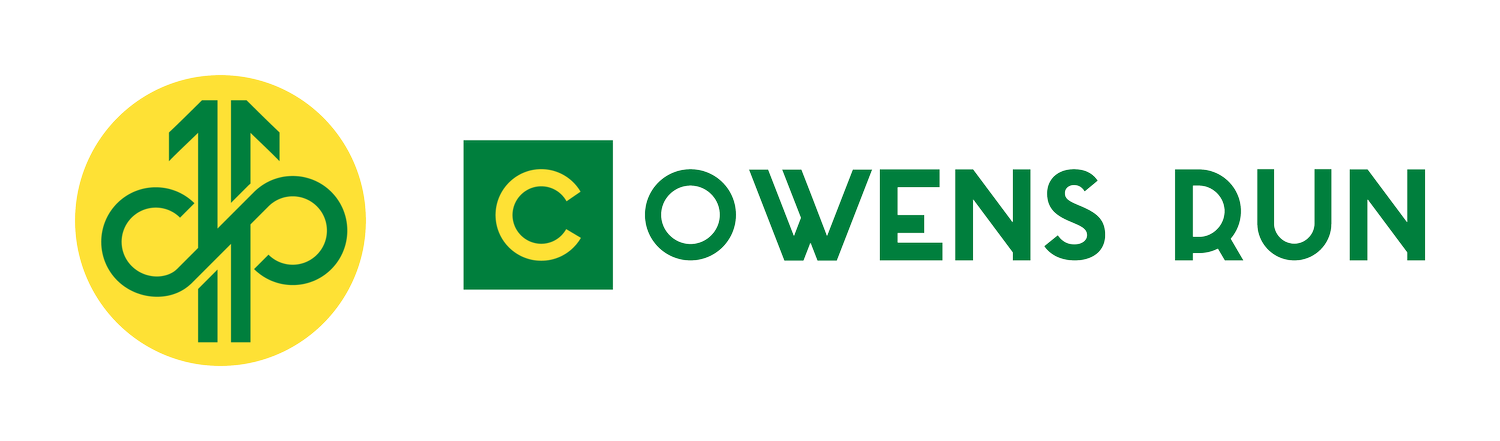
The Name: C Owens Run
I wanted a name that communicated action, which is what I do for clients. I run so they can crawl, then walk, then run. I also want to be transparent on what I do and how I do it so clients don’t have to wonder; I want clients to see what I do and how I help. Lastly, I want clients to know they are getting me, Colin Owens, and not a junior person that doesn’t have the perspective or experience to see the nuances of what needs to be done. I’ve heard too many clients talk about how disappointing that is when that “bait and switch” happens to them. It’s happened to me, too, and you kinda feel like you aren’t important enough. I always want my clients to know they are the reason that I do this and I am running hard for them.
The Logo:

There are a few elements here worth unpacking. First, you may see an upward arrow made of two parts. The arrow symbolizes upward growth, and it’s in two parts because the best solutions are created when both the client and I form a solution together. The arrow has even deeper meanings, though. The right side of the arrow is an ancient Nordic symbol called a Rune Laguz, which, among other things, represents the subconscious and the guidance your subconscious provides in life. Its inverse is also present on the left side, representing the conscious mind. The two paired together create the balance of the conscious and subconscious. It reminds me to never fully trust a gut feeling without examining it, and to never make a decision for a client purely based on data; it must also feel right for their brand. This is the embracing of constructive conflict even in my own mind. Questioning assumptions while questioning data is how you plant yourself in objectivity.
Secondarily, you’ll notice what looks like part of an infinity symbol. I wanted to communicate that the solutions we build together will stand the test of time. Are they one-and-done and you never have to revisit them again? Certainly not. Nothing is infinite other than infinity itself. Every approach, process and decision must be revisited on occasion to determine if it’s still the right approach, or if the challenge itself has evolved. That “almost infinity” symbol is also a representation of a “C” and an “O” interconnected: my initials.
The Colors: Green and Yellow
Most companies go with blues or reds in their logos. There’s nothing wrong with those colors at all, but if you start to take notice of brand color palettes, you start to notice how common they are. One of my desires was to look different because I take a different approach to that thing called “sales,” but the green and yellow are also symbolic in their own right. Green symbolizes new growth (such as leaves in spring), but it also represents money and revenue, which is result of doing sales the right way. Yellow symbolizes light: seeing things in new ways when we can illuminate them, and the ideas that emit from that metaphorical light bulb above each of our brains.
If you are embarking on a rebranding or creating a brand from scratch, I encourage you to think about what you want people to feel when they see and hear your brand, because companies don’t own the meaning of their brands. I don’t even own all of what you read above. It’s my intention to have my brand carry all this meaning for others, but it’s up to me to deliver on that brand promise. You may own the domain name and the trademark, but the emotional reaction people have to a brand is all about how you treat them and how you make them feel. They own what your brand means. If you ever want to chat about your brand and whether it’s delivering on your brand intentions, reach out anytime. I love talking about this stuff. And if I can help, I’m ready to combine forces to create growth that lasts.